Brand Identity, Space Identity, Interior Construct
2025 SEPTEMBER, 36sqm ; Brand Identity, Space Identity, Interior Construct
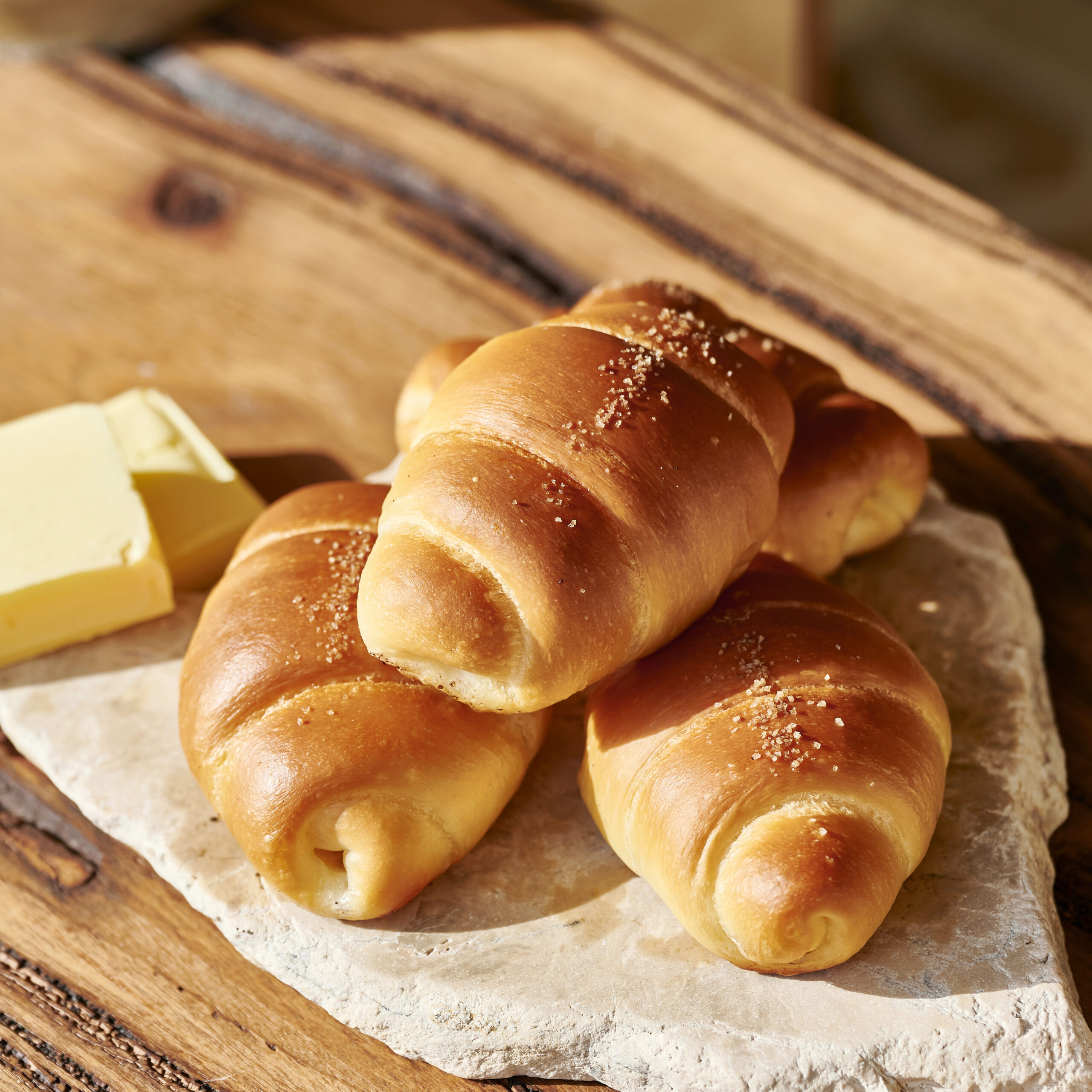
비버랩(Beaver Lab)이 브랜드 네이밍, 로고 및 패키지 디자인, 공간 디자인 및 설계와 시공까지 전 과정을 총괄한 프로젝트입니다. 브랜드 기획부터 공간의 완성까지, 애소아는 ‘소금빵’이라는 하나의 오브제를 다양한 감각으로 해석하여 공간 속에 담아내었습니다.
Beaver Lab oversaw the entire process of brand creation — from naming, logo and package design, to spatial planning and construction.
From concept to completion, ESOA reinterprets the single motif of “salt bread” through various senses and translates it into spatial experience.
애소아는‘정성(愛)’ ‘소금(鹽)’ ‘아(芽)’ 이 세 단어를 결합하여 정성으로 만들어낸 소금빵과 밀의 새싹이라는 의미를 담아 만든 상호명입니다.
ESOA combines the three Korean characters ‘Ae(愛, sincerity)’, ‘So(鹽, salt)’, and ‘A(芽, sprout)’.
The name embodies sincerity in the making of salt bread, as well as the vitality of sprouting wheat — the essence of its ingredients.
비버랩(Beaver Lab)이 브랜드 네이밍, 로고 및 패키지 디자인, 공간 디자인 및 설계와 시공까지 전 과정을 총괄한 프로젝트입니다.
브랜드 기획부터 공간의 완성까지, 애소아는 ‘소금빵’이라는 하나의 오브제를 다양한 감각으로 해석하여 공간 속에 담아내었습니다.
Beaver Lab oversaw the entire process of brand creation —
from naming, logo and package design, to spatial planning and construction.
From concept to completion, ESOA reinterprets the single motif of “salt bread”
through various senses and translates it into spatial experience.
애소아는‘정성(愛)’ ‘소금(鹽)’ ‘아(芽)’ 이 세 단어를 결합하여
정성으로 만들어낸 소금빵과 밀의 새싹이라는 의미를 담아 만든 상호명입니다.
ESOA combines the three Korean characters ‘Ae(愛, sincerity)’, ‘So(鹽, salt)’, and ‘A(芽, sprout)’.
The name embodies sincerity in the making of salt bread,
as well as the vitality of sprouting wheat — the essence of its ingredients.
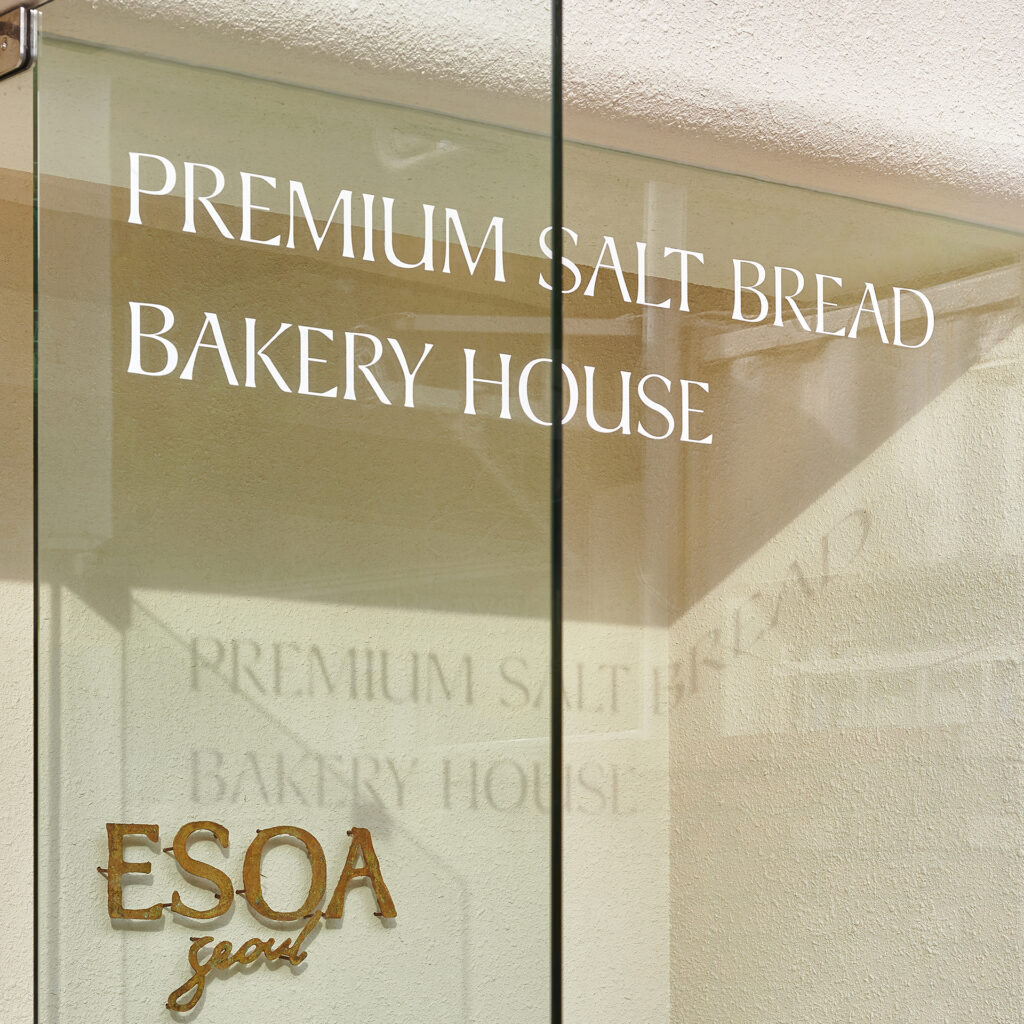
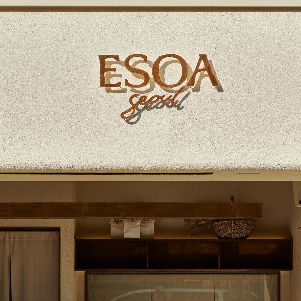
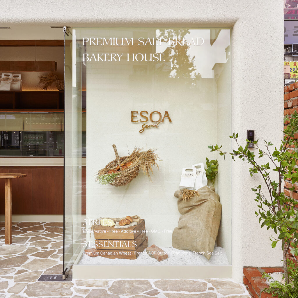
애소아의 로고는 정성을 다해 빵을 빚어내는 애소아의 감성을 담기 위해 직접 손으로 그려 완성했습니다. 세리프 서체와 필기체의 조화는 브랜드의 담백하면서도 따뜻한 깊이를 전합니다.
The ESOA logo was hand-drawn to capture the heartfelt, artisanal spirit of the brand that shapes each loaf with sincerity. The harmony of serif and handwritten strokes conveys a sense of refined simplicity and gentle warmth.
애소아의 로고는 정성을 다해 빵을 빚어내는 애소아의 감성을 담기 위해 직접 손으로 그려 완성했습니다.
세리프 서체와 필기체의 조화는 브랜드의 담백하면서도 따뜻한 깊이를 전합니다.
The ESOA logo was hand-drawn to capture the heartfelt,
artisanal spirit of the brand that shapes each loaf with sincerity.
The harmony of serif and handwritten strokes conveys a sense of refined simplicity and gentle warmth.
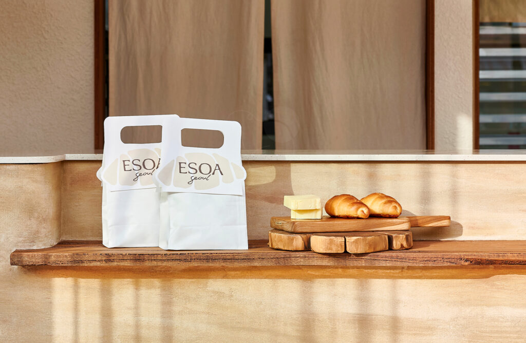
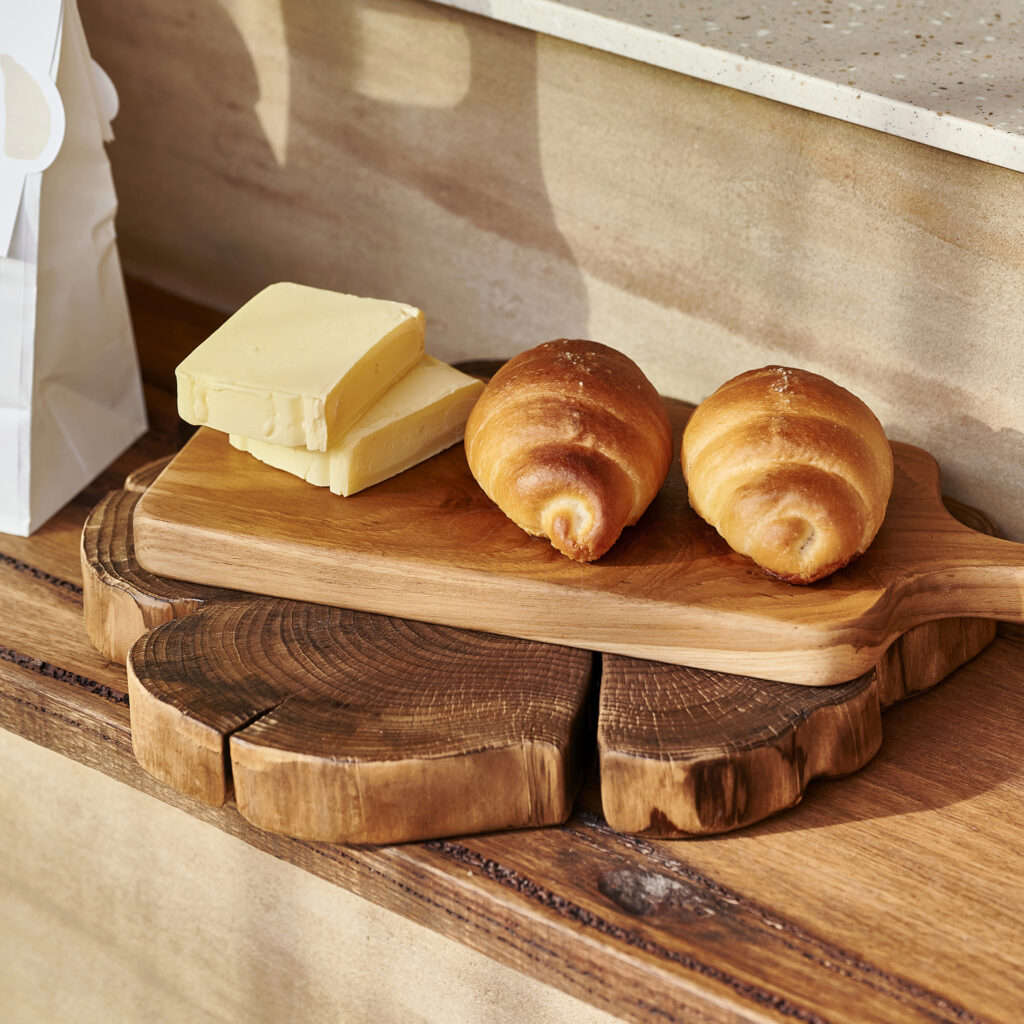
애소아의 패키지 상단의 손잡이는 애소아 소금빵의 형태를 본떠 디자인했습니다. 애소아의 상징인 소금빵이 소비자들에게 직관적으로 인식될 수 있도록 디자인했습니다. 갓 구워낸 소금빵의 브라운 컬러를 적용하여 맛의 기억과 시각적 경험이 자연스럽게 이어지도록 디자인했습니다.
The handle at the top was inspired by the shape of ESOA’s signature salt bread, allowing customers to recognize the brand’s identity at a glance. The warm brown tone, drawn from freshly baked salt bread, creates a seamless connection between taste and visual memory.
애소아의 패키지 상단의 손잡이는 애소아 소금빵의 형태를 본떠 디자인했습니다.
애소아의 상징인 소금빵이 소비자들에게 직관적으로 인식될 수 있도록 디자인했습니다.
갓 구워낸 소금빵의 브라운 컬러를 적용하여 맛의 기억과 시각적 경험이 자연스럽게 이어지도록 디자인했습니다.
The handle at the top was inspired by the shape of ESOA’s signature salt bread,
allowing customers to recognize the brand’s identity at a glance.
The warm brown tone, drawn from freshly baked salt bread,
creates a seamless connection between taste and visual memory.
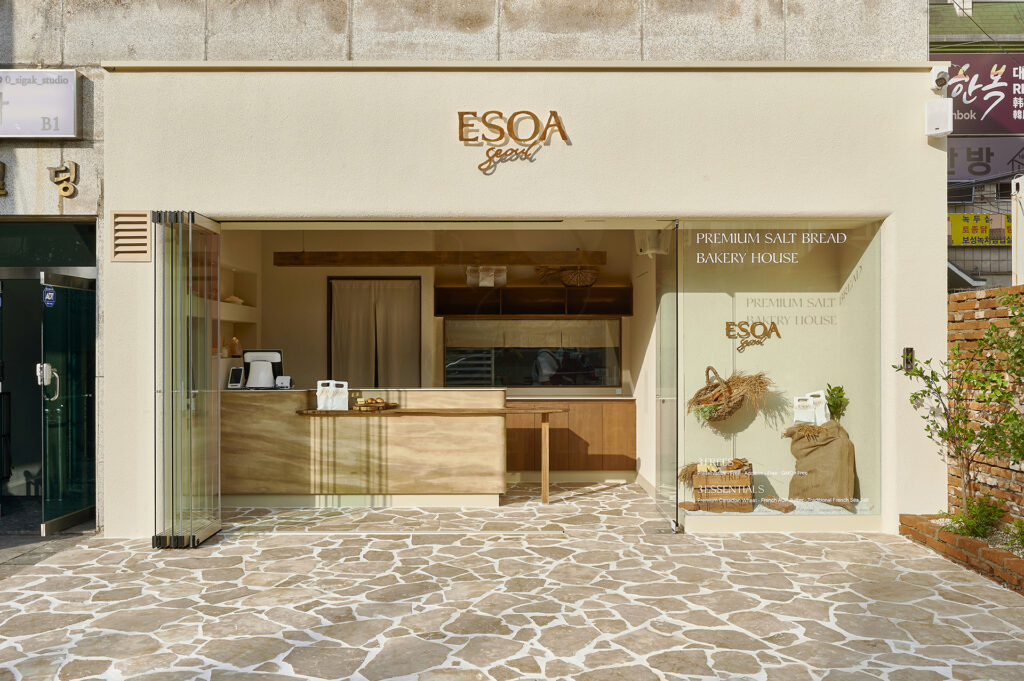
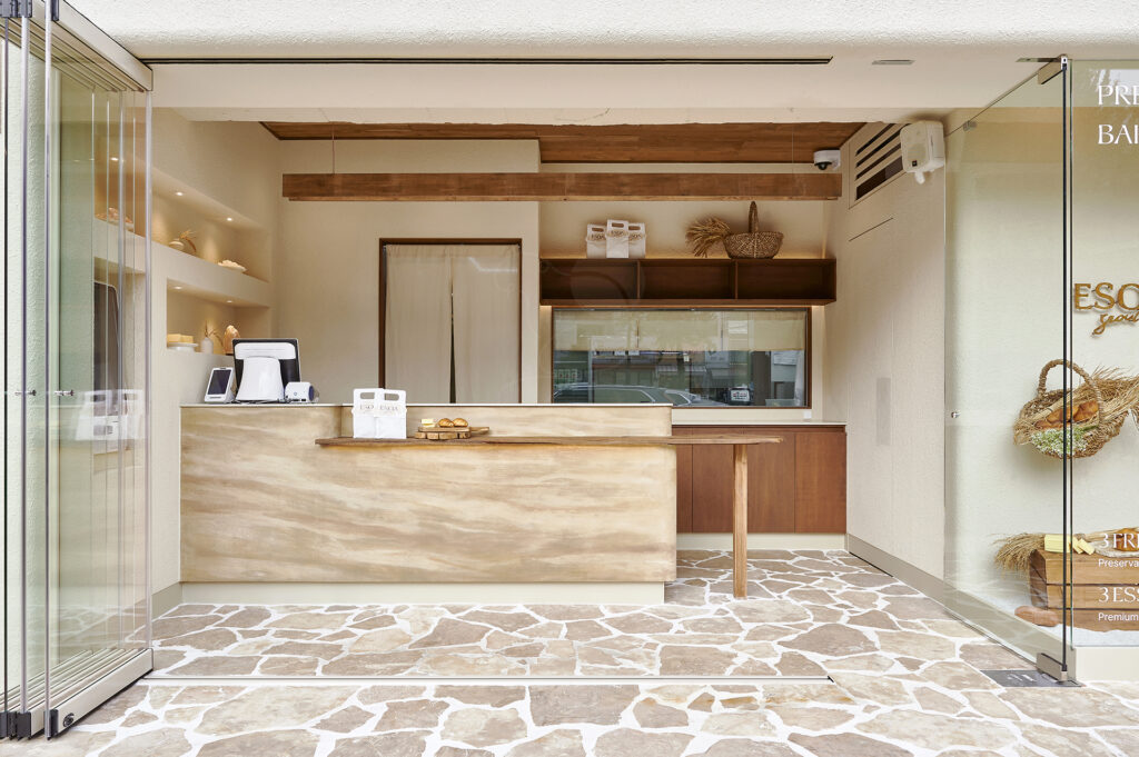
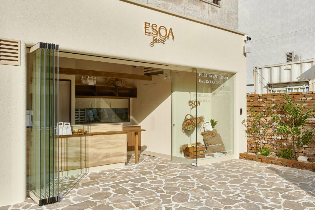
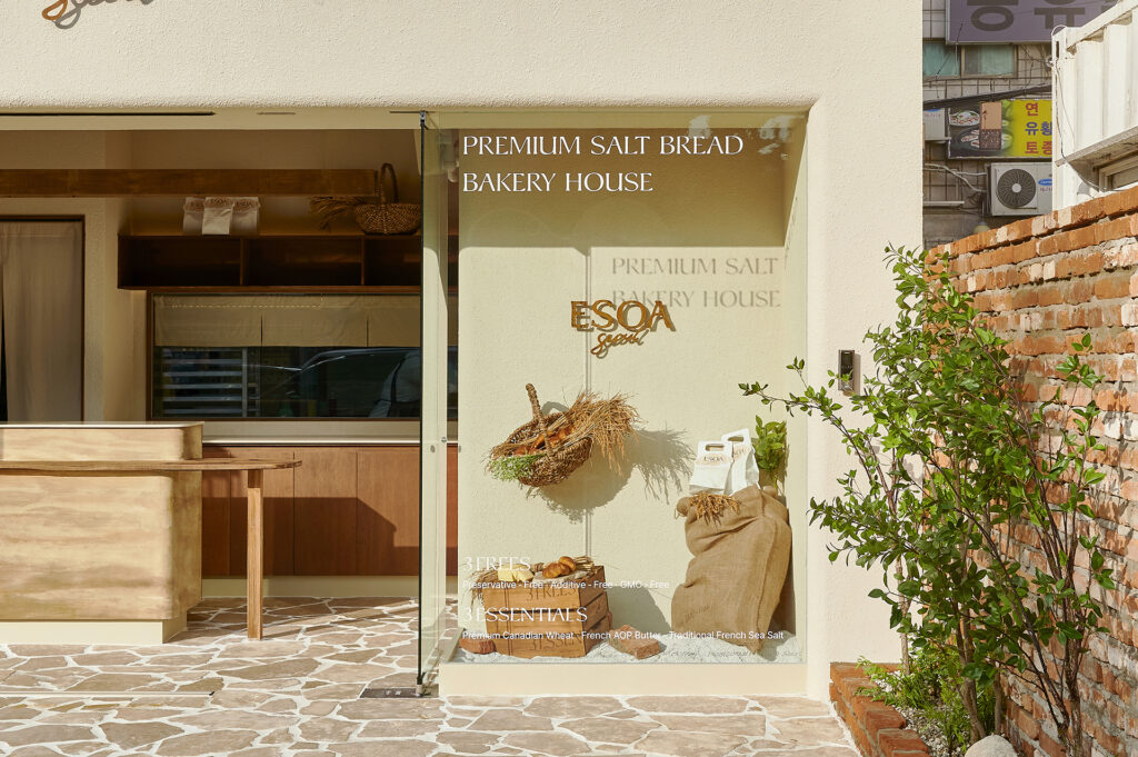
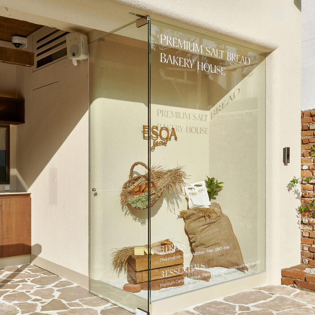
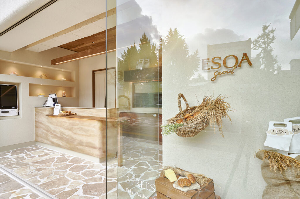
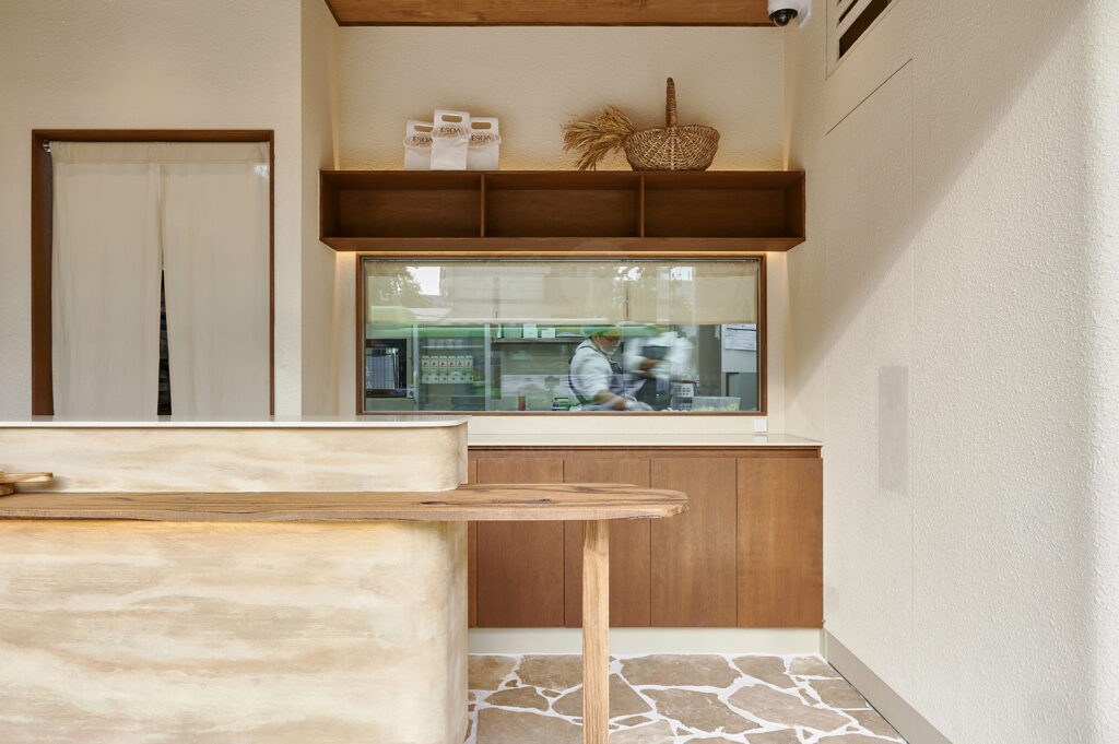
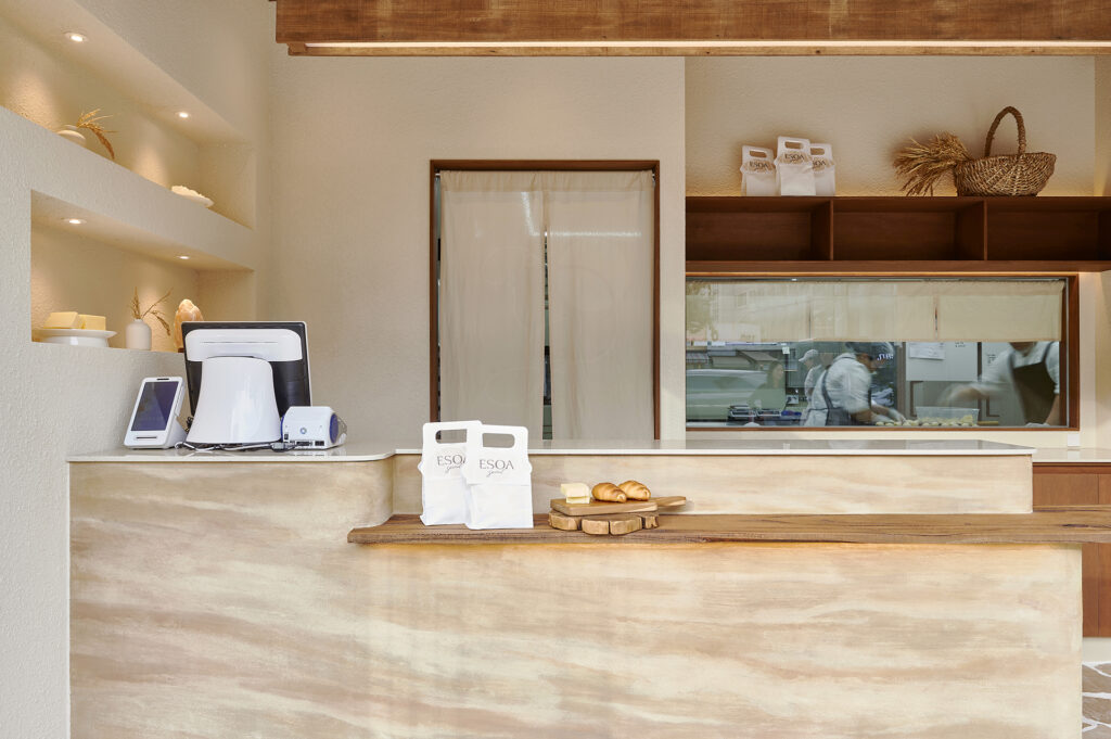
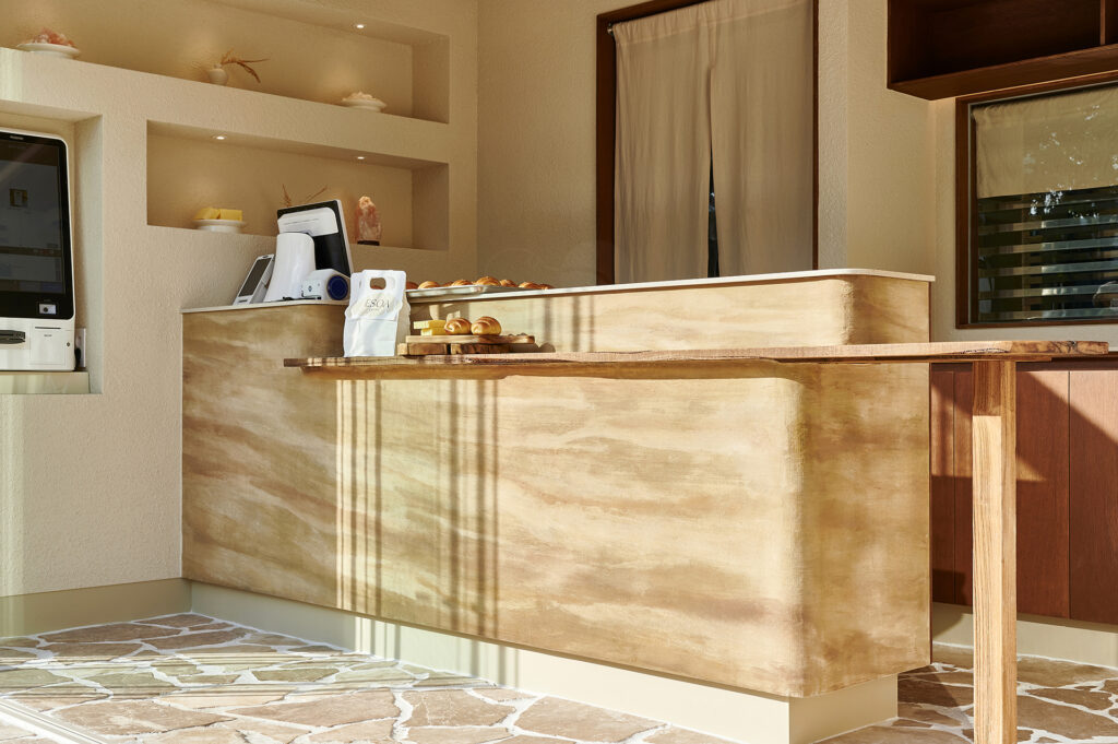
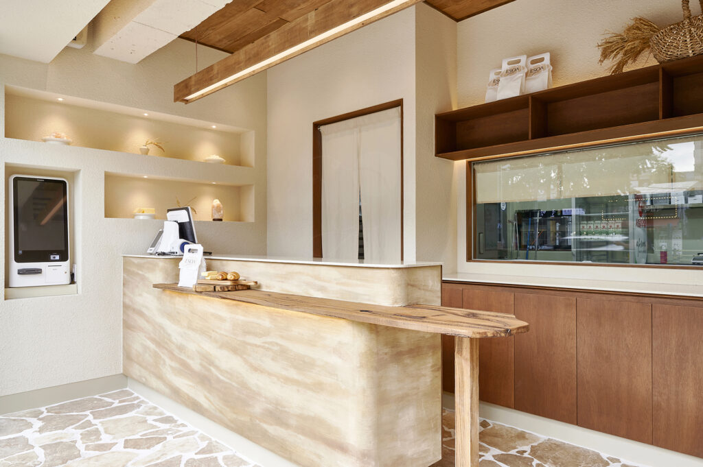
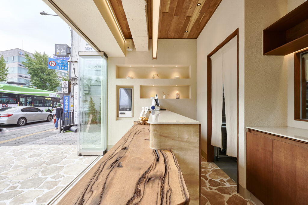
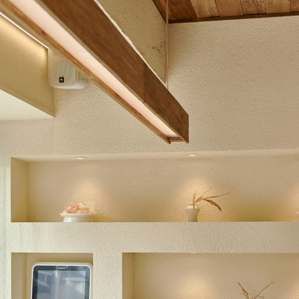
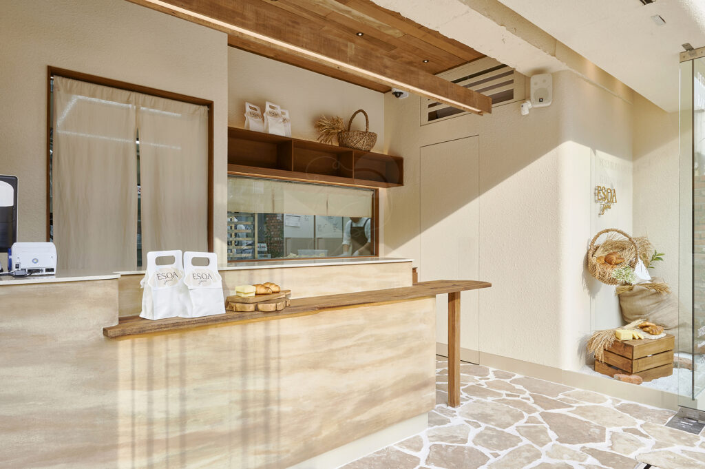
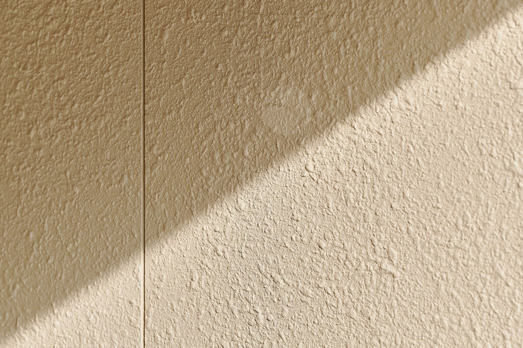
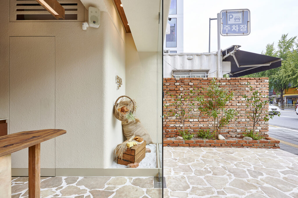
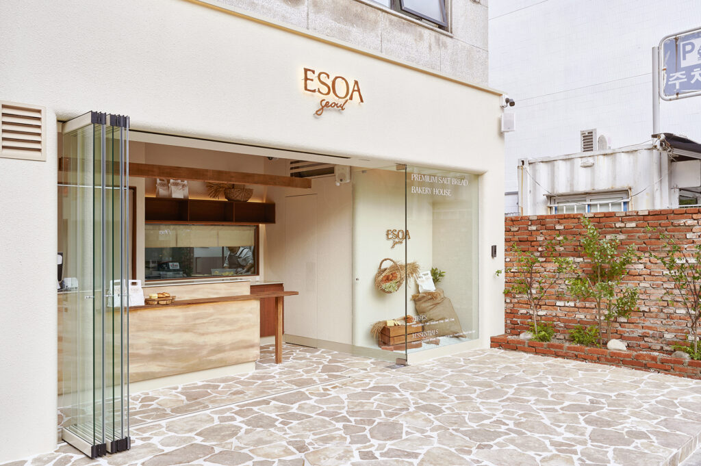
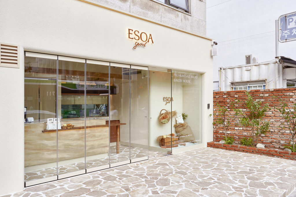
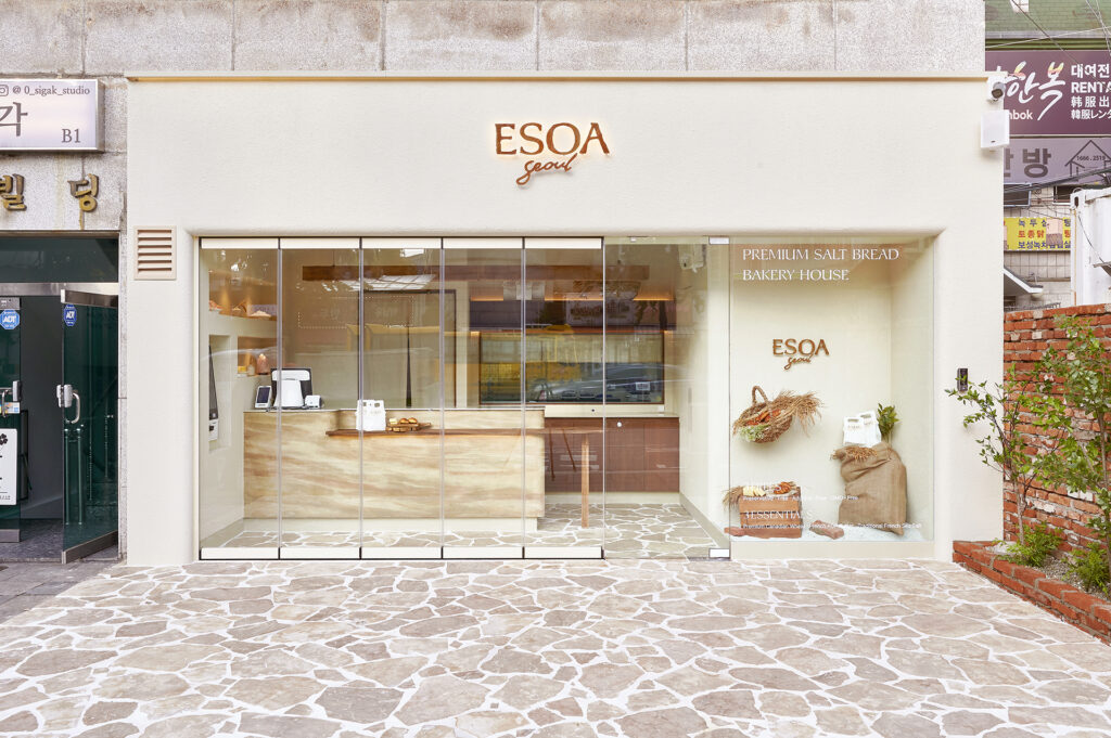
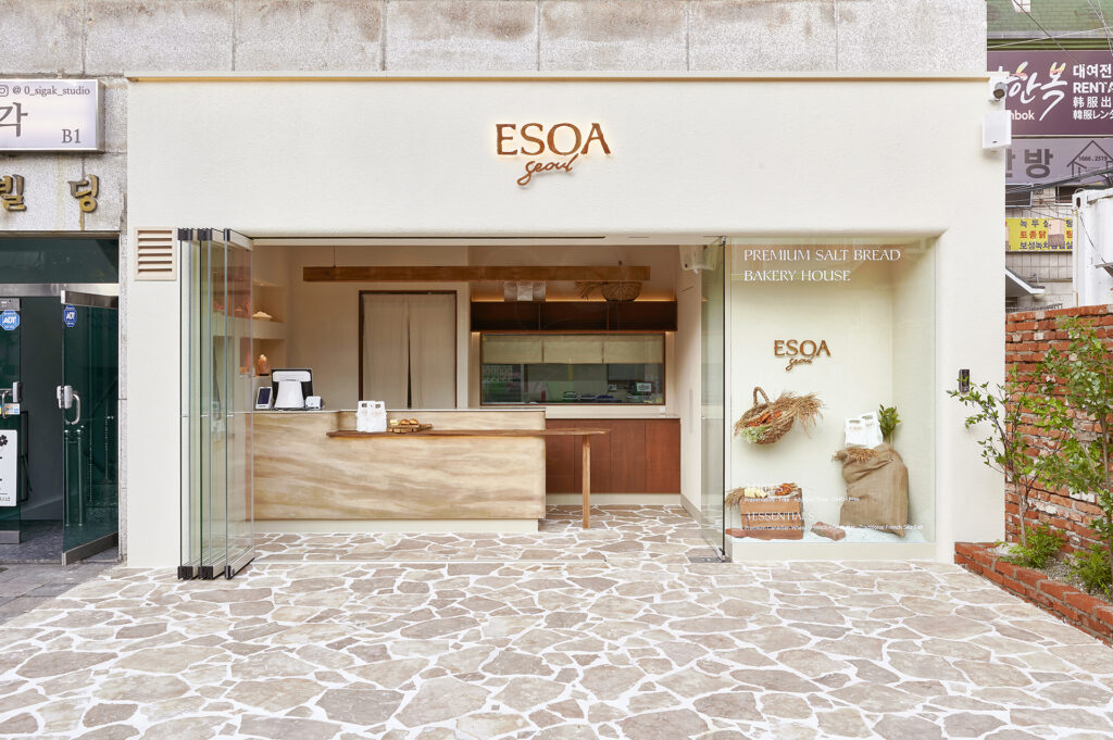
애소아의 공간은 소금에서 영감을 얻은 입자감이 살아있는 질감의 벽면과 가공되지 않은 느낌의 나무와 돌 등의 마감재로 완성되었습니다. 매장 중앙의 카운터는 소금빵의 레이어를 표현한 디자인으로 자연속 따뜻한 분위기와 함께 애소아만의 감성을 담아냈습니다.
The ESOA space features textured walls inspired by the crystalline surface of salt and finishes crafted from raw wood and stone in their natural form. At its center, a counter shaped after the layered texture of salt bread embodies ESOA’s warmth and sincerity within the space.
애소아의 공간은 소금에서 영감을 얻은 입자감이 살아있는 질감의 벽면과 가공되지 않은 느낌의 나무와 돌 등의 마감재로 완성되었습니다.
매장 중앙의 카운터는 소금빵의 레이어를 표현한 디자인으로 자연속 따뜻한 분위기와 함께 애소아만의 감성을 담아냈습니다.
The ESOA space features textured walls inspired by the crystalline surface of salt and finishes crafted from raw wood and stone in their natural form.
At its center, a counter shaped after the layered texture of salt bread embodies ESOA’s warmth and sincerity within the space.
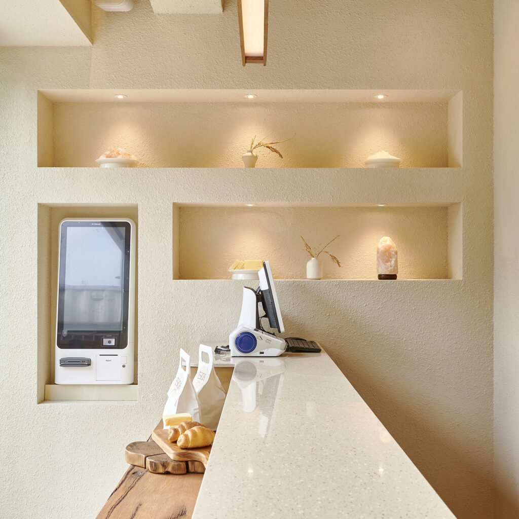
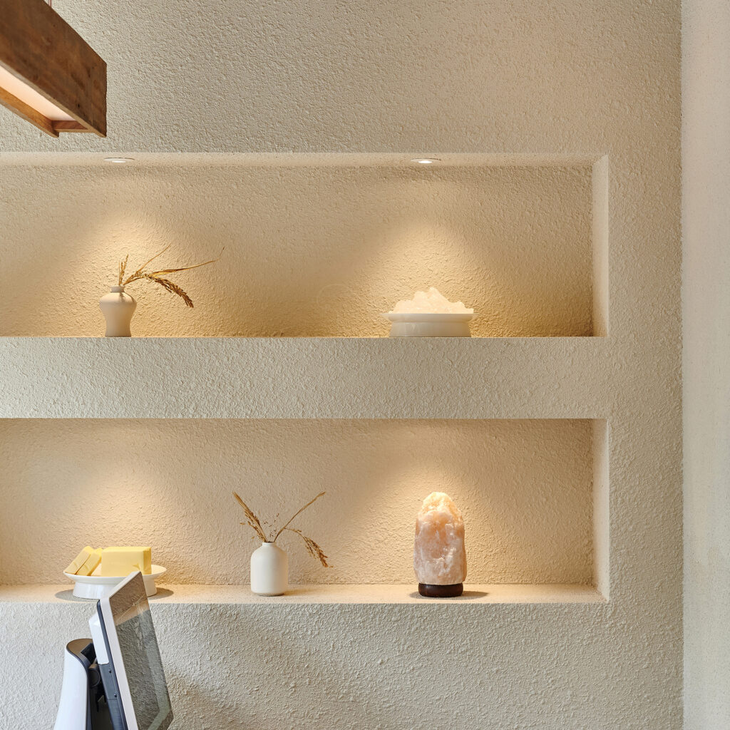
경복궁 인근에 위치한 매장의 특성을 반영해 소반과 항아리 등 한국적인 소품들과애소아의 빵과 원료들을 함께 디스플레이하여, 고요하고 절제된 아름다움 속에 애소아만의 정체성을 담아 완성했습니다.
Reflecting its location near Gyeongbokgung Palace, the interior incorporates traditional Korean objects such as soban tables and jars, displayed alongside ESOA’s breads and ingredients. The result is a quiet and restrained beauty that completes the brand’s identity.
경복궁 인근에 위치한 매장의 특성을 반영해 소반과 항아리 등 한국적인 소품들과애소아의 빵과 원료들을 함께 디스플레이하여,
고요하고 절제된 아름다움 속에 애소아만의 정체성을 담아 완성했습니다.
Reflecting its location near Gyeongbokgung Palace, the interior incorporates traditional Korean objects such as soban tables and jars,
displayed alongside ESOA’s breads and ingredients.
The result is a quiet and restrained beauty that completes the brand’s identity.
If you want to see the construction process of this space, please click the button below.
If you want to see the construction process of this space, please click the button below.